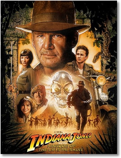
The official and just-released poster for this summer’s Indiana Jones and the Kingdom of the Crystal Skull follows the old-school painting style of movie marketing that was so prevalent in the 80s but has since dwindled out in favor of brash graphics, digital photography and Kiera Knightly’s side-boob. This poster could easily be hanging over the drive-in snack bar beside that of The Empire Strikes Back. Well done to Paramount and the filmmakers for staying true to the style of the first three films, yet again.

And don’t forget to visit my Indiana Jones and the Kingdom of the Crystal Skull Squidoo lens where I’ve aggregated all of the best RSS feeds related to Indy 4 news in one easy to read location. May 22nd draws ever closer, and perhaps I’ll once again be permitted to kiss a girl on the 23rd!

Beantown misses Pye this weekend. And Tiernan’s.
Throw up on Johnny Mac for me tonight, will ya?
it’s gonna be tough to match or even come close to the quality and originality of the original Indiana Jones’